ビフォーアフター比較
一つの変化を、きれいな仕切りと揃った構図の対になる2パネルに分け、キャプションや数値は書いたとおりに表示します。
更新日:
プロンプト全文
英語のプロンプトに入力例を添えています。生成前に被写体や詳細を調整してください。元の作例の入力内容と生成設定は完全には確認できていません。
推奨モデル: GPT Image 2
Design a clean before-and-after comparison image built as two clearly divided panels of equal size, split by an elegant vertical center divider. Place the before state in the left panel and the after state in the right panel, keeping the subject, framing, scale, angle, and camera distance identical between the two sides so the only visible difference is the transformation itself, with the left showing the starting condition and the right showing the improved result. Label each side with a small, clear caption, and if the user provides metrics or result data, present them in a tidy row or small grid beneath or between the panels with clean type. Render any text the user supplies, including the before and after captions, percentages, or data points, exactly as written, correctly spelled; never invent statistics, claims, or filler wording, and leave data areas clean if no numbers are given rather than adding placeholder text. Keep lighting consistent and honest across both panels so the comparison reads as credible rather than exaggerated, and add a small product thumbnail if it belongs. Use a clean, professional layout with aligned margins and balanced negative space. Do not add watermarks or clutter. The result should look like a trustworthy campaign comparison. Use the details below for the subject and the exact before and after states.
一次制作のサンプル
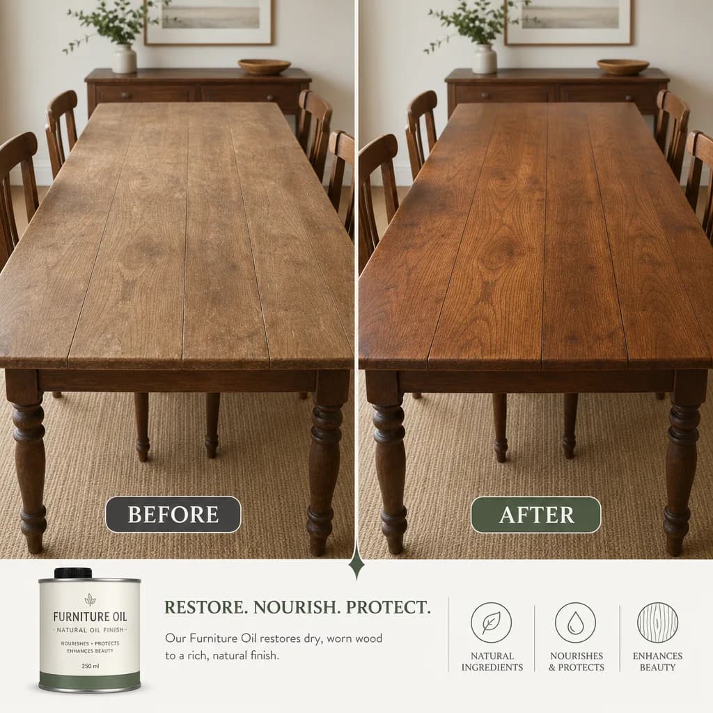
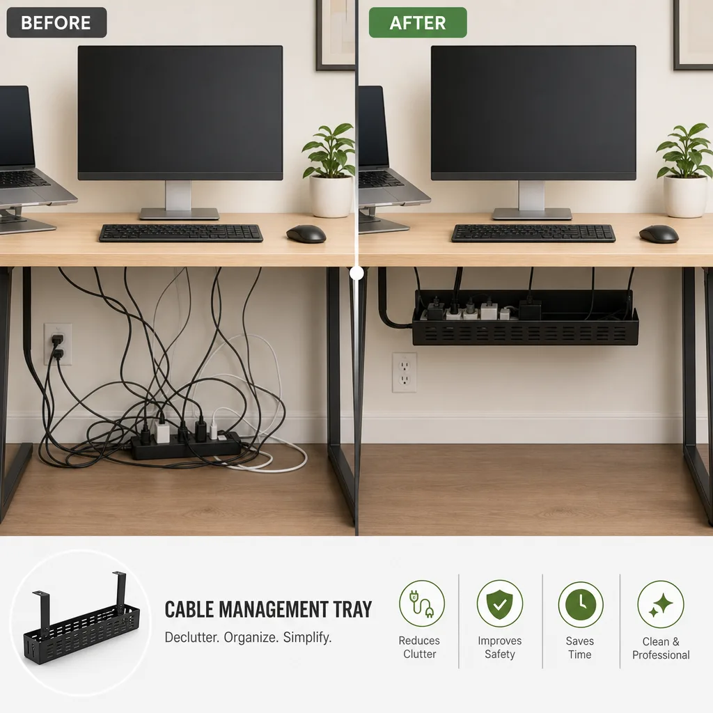
プロンプトのヒント
- ビフォーとアフターの状態を明確に説明し、2つのパネルが結果だけで違うようにしましょう
- キャプションやパーセントは引用符で囲み、ラベルを正確に表示して信頼性を保ちましょう
- 両方の状態で被写体と角度を同じに保ち、比較が正直に見えるようにしましょう
関連するプロンプトレシピ

コマースレイアウト
プロモーションポスター
明確な見出しゾーン、主役の製品、行動喚起を備えた洗練された縦型プロモーションポスターを配置し、指定したコピーを記載どおりに表示します。
プロンプト全文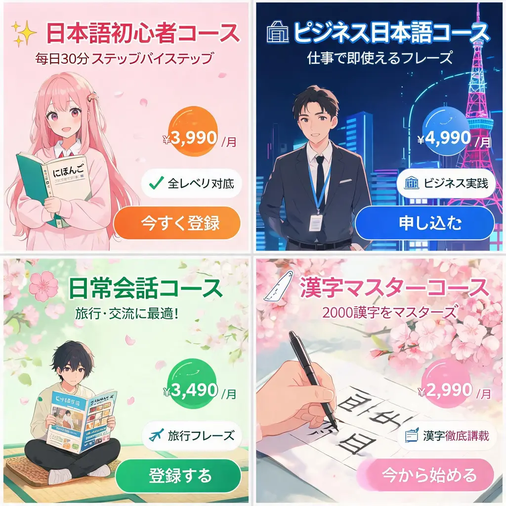
コマースレイアウト
日本風広告バナーセット
ひとつのキャンペーン概要から、力強いキャッチコピー、価格バッジ、訴求シール、ビジュアル、明確なCTAボタンを備えた統一感のあるWeb広告バナー一式を作ります。
プロンプト全文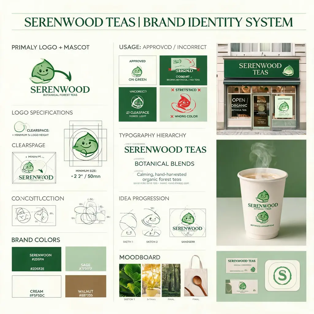
コマースレイアウト
ブランドアイデンティティボード
架空ブランドの概要から、ロゴ構造、カラーパレット、書体、使用ルール、コンセプトスケッチ、洗練された実用モックアップをまとめたデザイン会社品質のVIボードを作ります。
プロンプト全文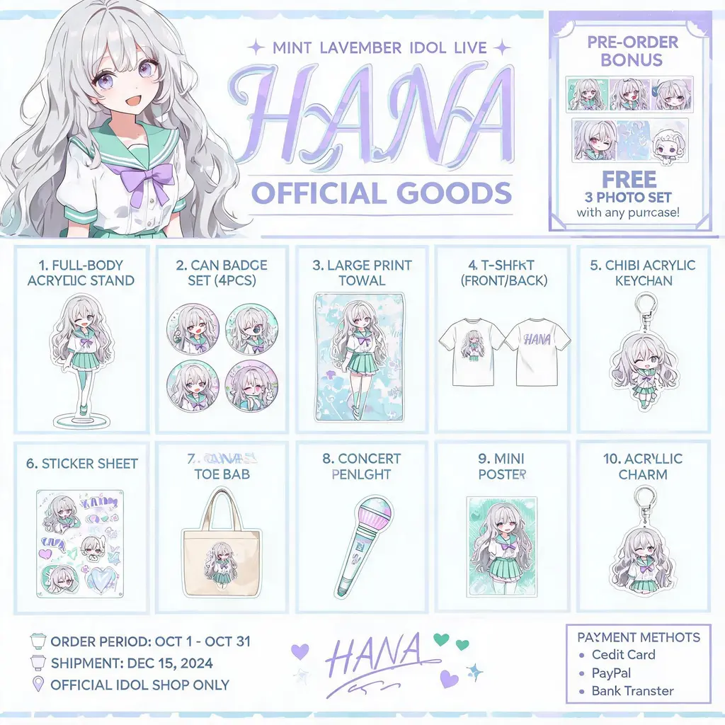
コマースレイアウト
キャラグッズカタログ
オリジナルキャラクターを公式グッズ告知フライヤーに。アクリルスタンドや缶バッジ、Tシャツ、キーホルダーをナンバリング付きのグリッドで並べ、ヘッダーにはキービジュアルを配置します。
プロンプト全文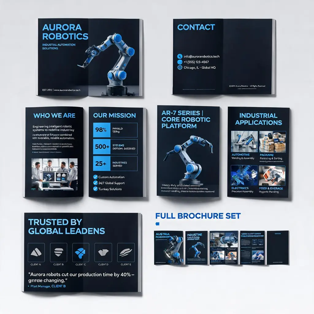
コマースレイアウト
企業パンフレット一式
会社や製品の説明を、プレミアムな複数ページのパンフレット一式に。表紙・会社紹介・製品・活用シーン・事例の各ページをひとつのブランドビジュアルで統一し、全ページのプレビューも添えます。
プロンプト全文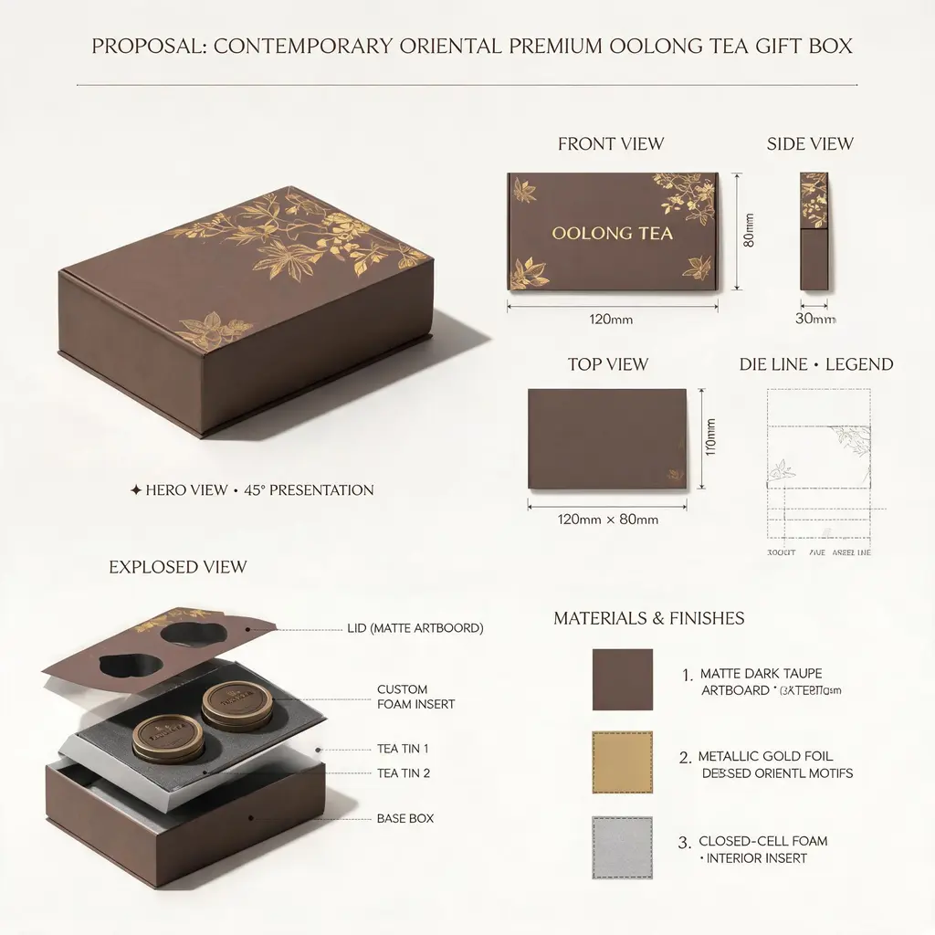
コマースレイアウト
デザイン提案ボード
どんなプロダクトやパッケージのアイデアも、一流スタジオの提案シートに。ヒーローレンダリング、三面図、罫線図、内部の分解図、素材スウォッチ、寸法注記を一枚のボードにまとめます。
プロンプト全文