How to build a whole brand visual set with AI images
One AI image is easy. Five that look like the same brand is the actual job. Here is a workflow for building a consistent product set — and the failure mode that shows up when you scale it.
Generating one convincing product image is no longer the hard part. The hard part is generating the fifth one and having it still look like the same brand — same logo geometry, same typeface, same label copy, same material, same light.
Microsoft published a set of sample images for a fictional candle brand, ORVA, across its MAI-Image-2.5 page. Read as marketing it is five nice images. Read as evidence it is something more useful: a worked example of what holds across a series, what quietly drifts, and where the drift lands. That makes it a good spine for a workflow you can run on any capable image model.
This guide covers building a brand visual set: the order to generate in, how to write each shot so the brand survives it, and the one failure mode that reliably shows up as a set grows.
What a brand set has to hold
A single image has to look good. A set has to agree with itself. Before generating anything, write down what must be byte-identical across every shot — this becomes your acceptance checklist:
| The invariant | For the ORVA set |
|---|---|
| Wordmark | "ORVA" in a high-contrast serif, wide letterspacing |
| Secondary copy | "SCENTED CANDLE / BOUGIE PARFUMÉE" |
| Fine print | "NET WT. 8.5 OZ | 240 G" |
| Vessel | Amber glass tumbler, matte finish, black band at the base |
| Palette | Amber, black type, warm off-white surfaces |
| Light | Hard directional daylight with soft foliage shadows |
Everything not on that list is allowed to change — that is what makes it a set rather than five copies. The list is short on purpose. A long invariant list is a long list of things a model can break.
Step 1: lock the identity on the simplest possible surface
Start with the shot that has the fewest competing elements. For a brand mark, that is the mark alone on a plain material:
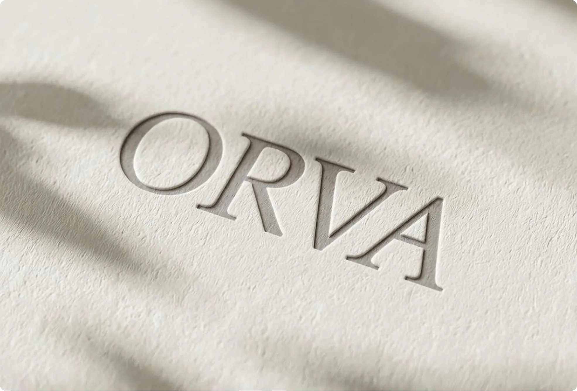
This image has one job: get the letterforms right. No product, no scene, no secondary copy competing for fidelity. Embossing is a useful trick here because it forces the model to commit to a single consistent letter geometry — the debossed edge has to follow the actual glyph shape, so errors become visible rather than hiding in flat type.
Once this is approved, it is your reference image for everything downstream. Do not re-derive the logo from text in later prompts; carry it forward.
Tip
Approve the identity plate before generating a single product shot. Every later image inherits its errors, and fixing a wordmark in shot five means regenerating shots one through four to match.
Step 2: build the hero product shot
The second image adds the vessel and the full label, still on a neutral surface with controlled light:
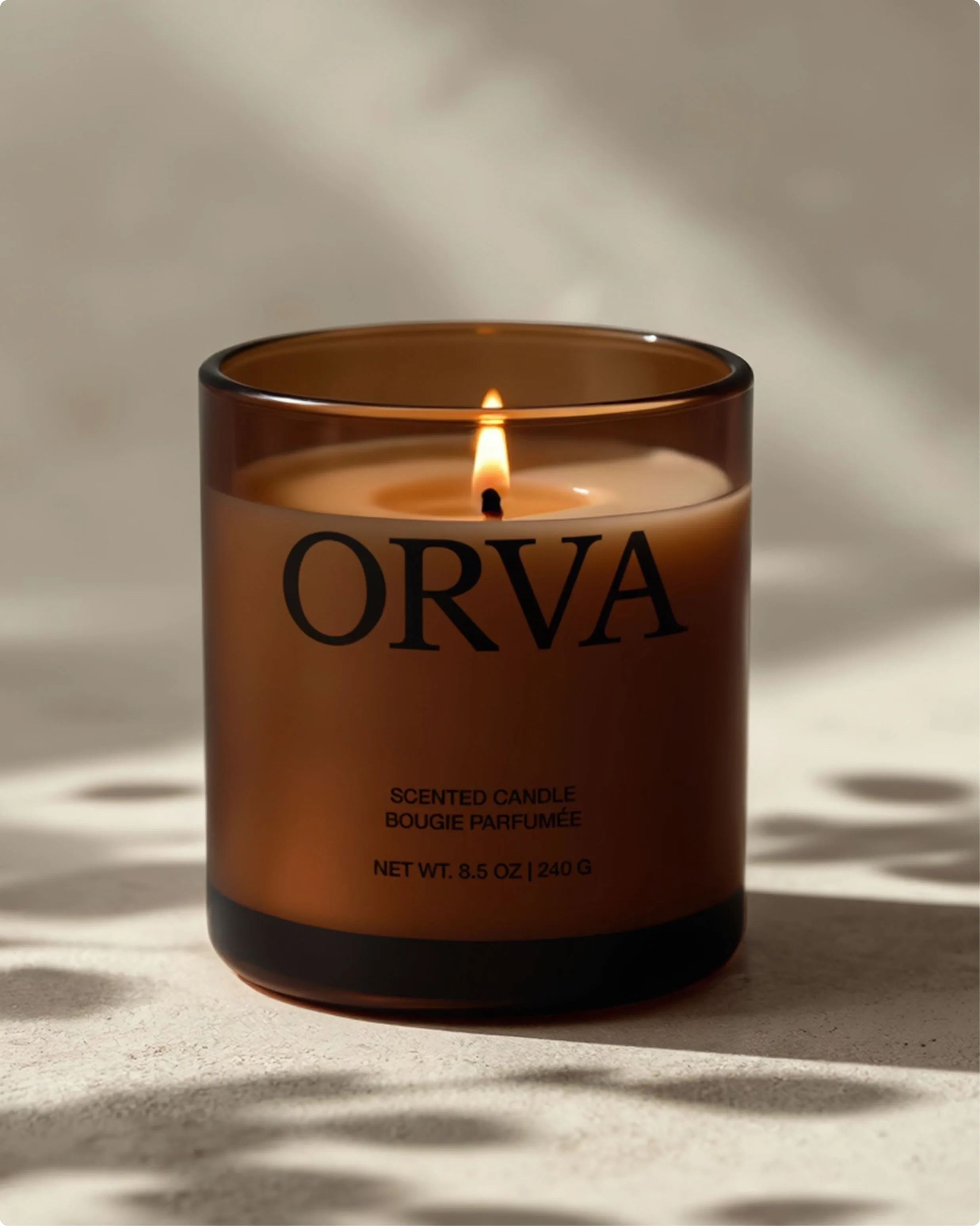
This is the image that has to be perfect, because it is the one you will check every other shot against. Three details are worth auditing specifically:
- The accented character. "PARFUMÉE" carries an É. Accents, ligatures, and non-Latin scripts are where in-image text fails first — and a French line on a candle label is exactly the kind of small copy nobody proofreads until it is printed.
- The unit line. "NET WT. 8.5 OZ | 240 G" mixes a decimal, two unit systems, and a pipe character. If your label has a legal or regulatory line, this is where you verify the model can hold it.
- The type hierarchy. Wordmark dominant, product descriptor secondary, fine print smallest. A model that spells everything correctly but weights the three blocks equally has produced an unusable label.
Step 3: place the product in context
With the hero approved, the set expands into scenes. Each new shot changes the environment while inheriting the product:
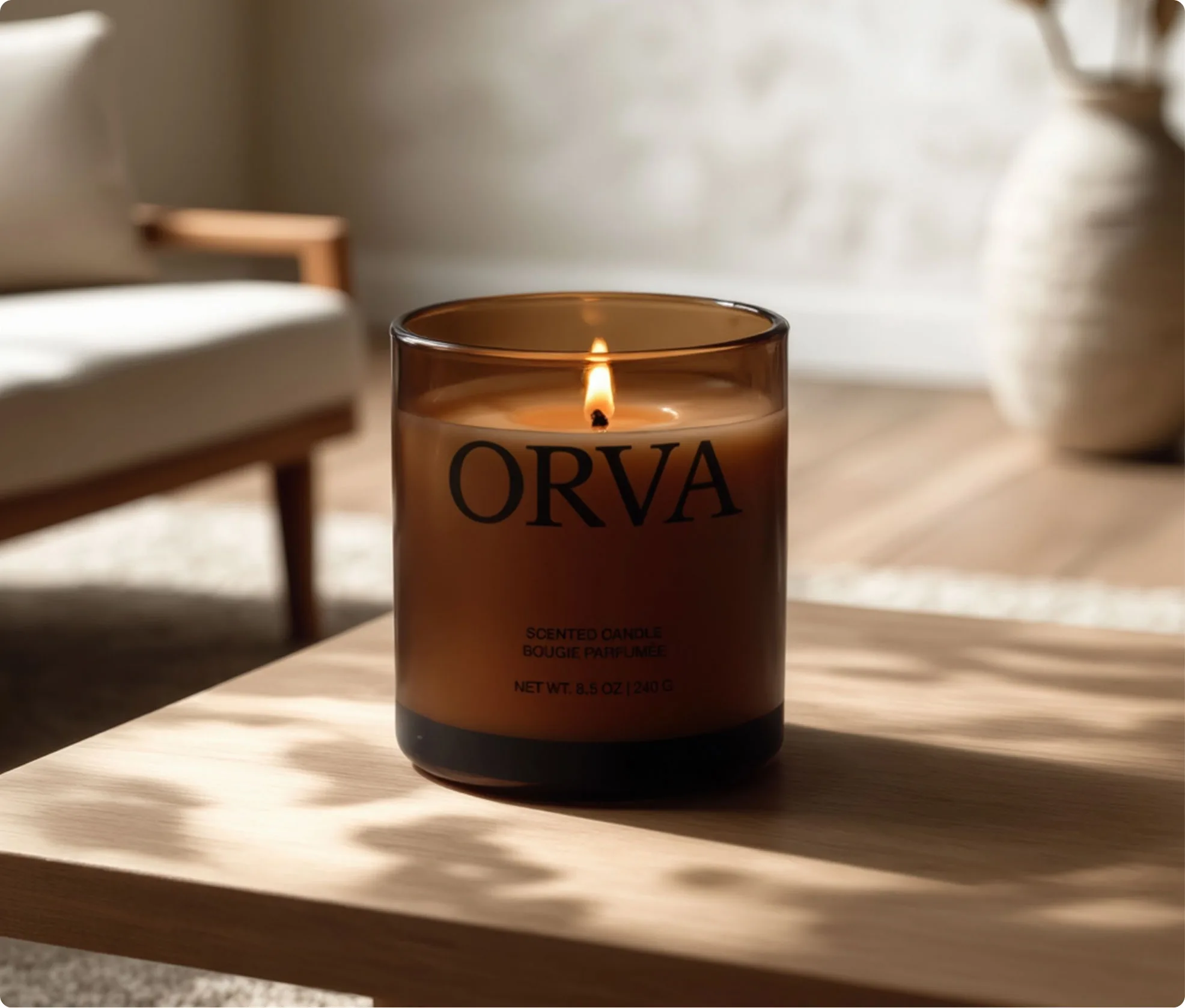
The prompt for a shot like this should read as environment plus inherited product, not as a fresh description. Name the scene in detail and the product by reference:
Place the approved candle on a light oak coffee table in a sunlit living room. Keep the label, glass colour, and black base band exactly as in the reference. Blurred mid-century armchair and woven vase in the background, hard morning light, soft shadows across the table.
The environment gets the adjectives. The product gets a preservation instruction. Reversing that — re-describing the candle in every shot — is how a set drifts, because each fresh description is a fresh chance for the model to reinterpret the label.
Step 4: add motion and mood shots
Not every image in a set has to be legible. Some exist for rhythm:
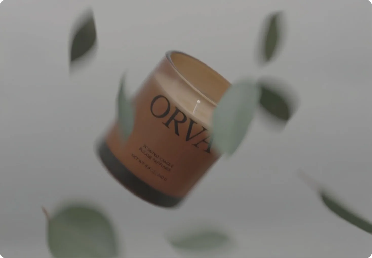
This one is worth reading carefully, because it shows the difference between acceptable softness and drift. The wordmark is still legible; the fine print is not. In a motion shot that is physically right — a tumbling jar should have unreadable small type. The test is whether the illegibility has a stated cause in the image. Blur from motion is a look. Blur with a static camera and a still product is a defect.
Step 5: the group shot, and where sets actually break
The last shot puts the product among companions — the assortment image every brand needs:
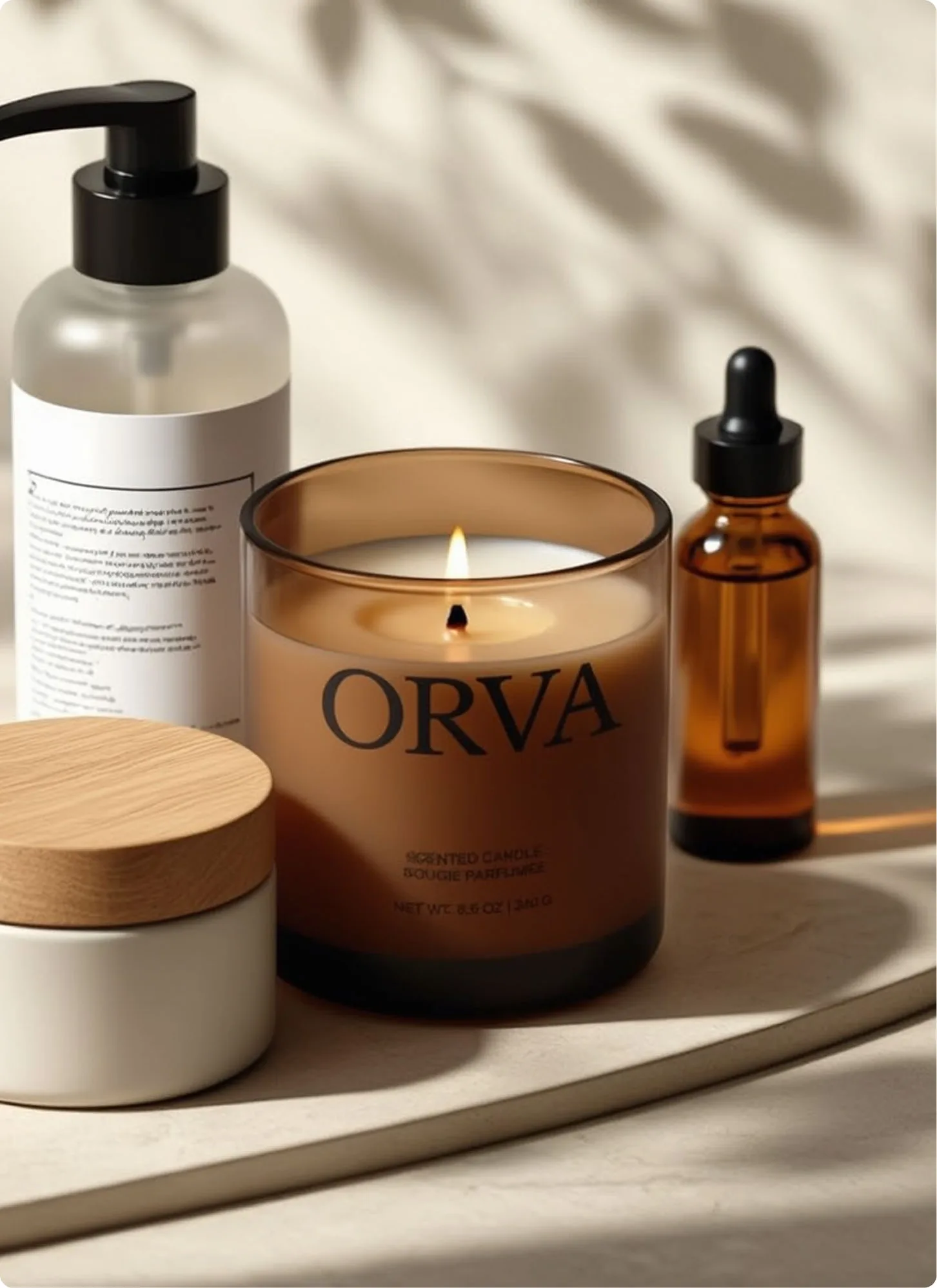
Look at the left-hand pump bottle. Its label is covered in text-shaped marks that are not words in any language. Then look back at the candle's own fine print in the same image — "SCENTED CANDLE / BOUGIE PARFUMÉE" and the unit line are noticeably softer and more distorted than they were in the hero shot.
This is the failure mode worth internalizing, and it is not random: fidelity follows attention. The element the prompt names gets rendered correctly. Elements that are merely present get plausible-looking texture where text should be. As you add objects to a frame, the model's budget for any one of them shrinks — so the shot with the most props is the shot most likely to produce gibberish on a label you were not thinking about.
Warning
Group shots are where brand sets fail, and they fail quietly — a wrong logo is obvious, but a bottle of pseudo-text in the background reads as "a bottle" until someone zooms in. Audit every legible surface in a group shot at full resolution before approving it, not just the hero product.
The practical response is not to avoid group shots. It is to plan for them:
- Give secondary objects no text at all. Unbranded, unlabelled companions are both more realistic in a flatlay and impossible to get wrong.
- Name one hero per frame. State explicitly which object must carry accurate branding, and describe the rest as generic shapes and materials.
- Compose the group, then add the label as a second edit. Generate the arrangement first, then use a targeted edit to place accurate type on the one product that needs it.
- Crop as a fallback. If a background label came out as noise and the composition is otherwise right, a tighter crop is faster than a regeneration.
The order that makes this work
The whole workflow is one principle applied five times — establish the thing that must not change, then change everything else around it:
- Identity plate. Mark alone on a plain material. Approve the letterforms.
- Hero product. Full label, neutral surface, controlled light. Audit accents, units, and hierarchy.
- Lifestyle context. New environment, product carried by reference and preservation instruction.
- Mood and motion. Softness is fine when the image states its cause.
- Group shot. One named hero, unbranded companions, full-resolution audit.
Each step inherits from the one before it rather than starting over. That is the difference between a set and five images of a similar candle.
FAQ
How do I keep a logo consistent across AI-generated images?
Approve a single identity image first and carry it forward as a reference image, rather than re-describing the logo in each prompt. Every fresh text description is a fresh opportunity for the model to reinterpret the letterforms.
Why does text in AI images come out as gibberish?
Most often because the element carrying that text was not named in the prompt. Models allocate fidelity to what they are asked about; unnamed objects get texture that resembles writing. It also happens with very small type, accented or non-Latin characters, and crowded frames.
How many reference images should I use for a product set?
Start with one approved identity or hero image and add references only for what actually needs to persist — typically the product and its label. More references are not automatically better; each one competes for influence over the result.
Should I generate a brand set in one prompt or several?
Several. One shot per prompt, each inheriting the approved product, gives you a checkpoint after every image and a clear culprit when something drifts. A single prompt asking for five images gives you no way to isolate a failure.
What should I check before approving a product image?
At minimum: wordmark geometry, every line of label copy including accents and units, type hierarchy, material and colour of the vessel, and any legible text on secondary objects. Check at full resolution, not at thumbnail size.
Can I use AI product images commercially?
That depends on the model's terms, your rights to any uploaded reference material, and whether the output infringes third-party trademarks or designs. Generated brand-like imagery for a brand you do not own carries real risk — check the provider's commercial terms before publishing.
Getting started on OmniArt
Open the OmniArt image workspace and run the first two steps on a brand of your own: an identity plate, then a hero product shot with the full label. Stop there and audit the fine print at full size before going any further — those two images decide whether the remaining three are worth generating.
For the prompt-writing techniques behind each step, the four prompts Microsoft published covers naming an object so an edit stays local, and the Seedream 5.0 Pro launch guide covers its reference-image controls. When the stills are approved, OmniArt keeps image and video models in the same workspace, so an approved hero shot can go straight into motion without rebuilding the brand somewhere else.
Ready to create?
Start generating amazing content with AI