改造前後對照圖
把一次改變拆成左右兩格,中間乾淨分隔、構圖一致,你寫的說明文字和數值會照原樣呈現
更新日期:
完整提示詞
英文提示詞包含建議的範例需求。生成前請調整主體和細節。原始範例輸入及生成參數尚未完全核實。
推薦模型: GPT Image 2
Design a clean before-and-after comparison image built as two clearly divided panels of equal size, split by an elegant vertical center divider. Place the before state in the left panel and the after state in the right panel, keeping the subject, framing, scale, angle, and camera distance identical between the two sides so the only visible difference is the transformation itself, with the left showing the starting condition and the right showing the improved result. Label each side with a small, clear caption, and if the user provides metrics or result data, present them in a tidy row or small grid beneath or between the panels with clean type. Render any text the user supplies, including the before and after captions, percentages, or data points, exactly as written, correctly spelled; never invent statistics, claims, or filler wording, and leave data areas clean if no numbers are given rather than adding placeholder text. Keep lighting consistent and honest across both panels so the comparison reads as credible rather than exaggerated, and add a small product thumbnail if it belongs. Use a clean, professional layout with aligned margins and balanced negative space. Do not add watermarks or clutter. The result should look like a trustworthy campaign comparison. Use the details below for the subject and the exact before and after states.
官方範例
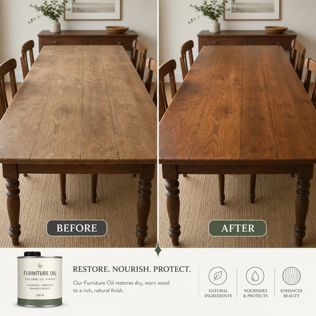
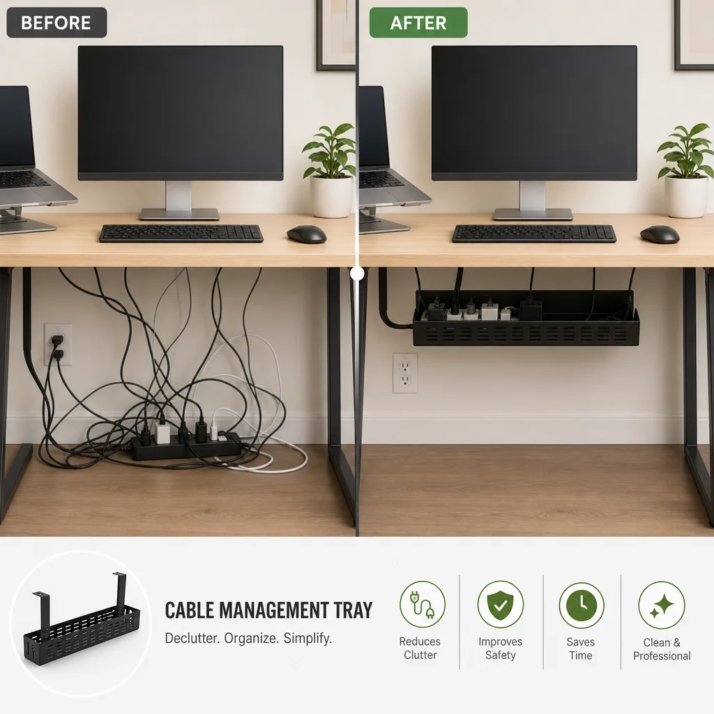
相關的提示詞配方

電商版面
促銷活動海報
排一張精緻的直式促銷海報,標題區、主角產品和行動呼籲清楚分明,你提供的文案會照原樣呈現
完整提示詞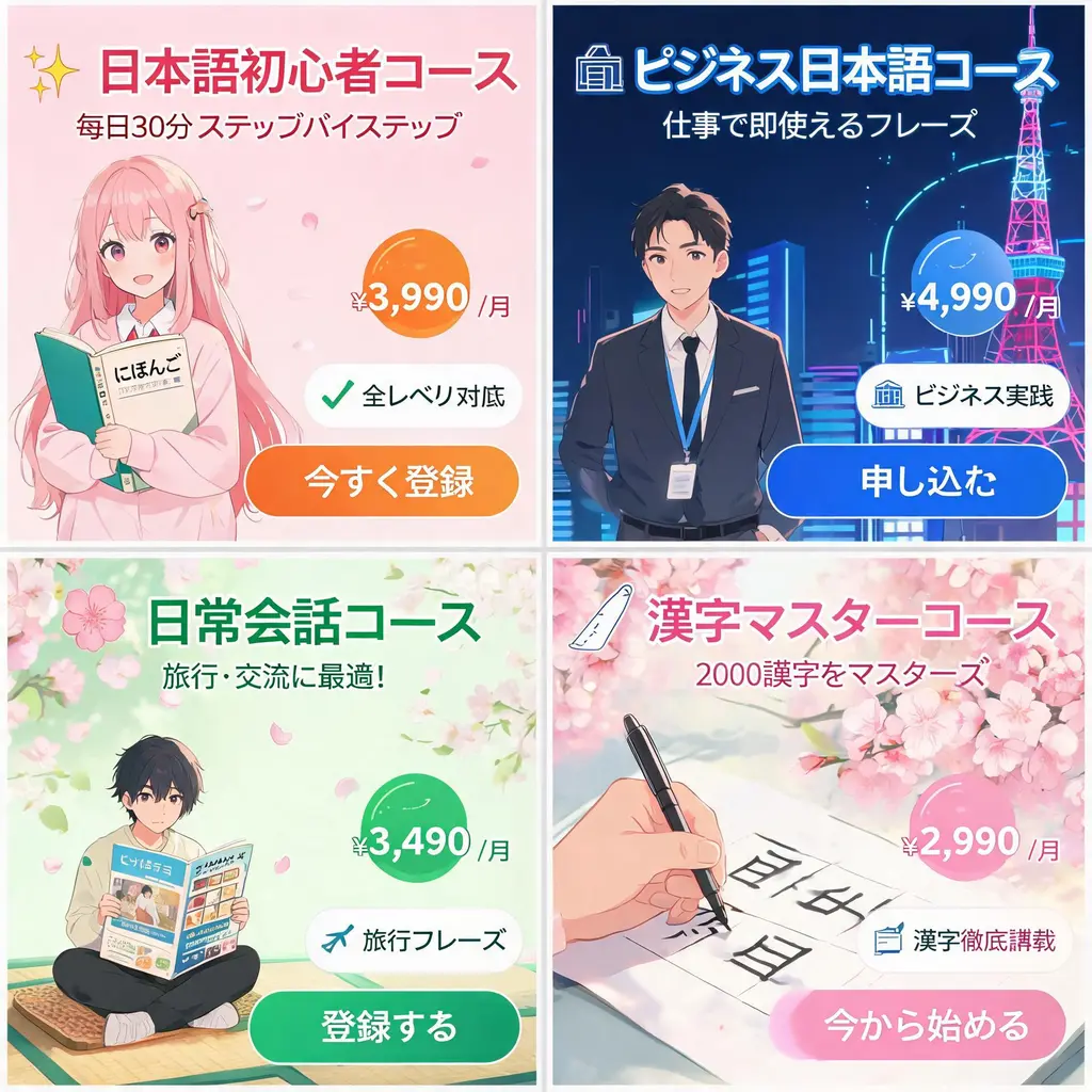
電商版面
日系網頁橫幅組
把一份活動需求變成一整組日系風格的網頁橫幅,包含有力的宣傳標語、價格標章、賣點印章、主視覺圖和清楚的行動按鈕
完整提示詞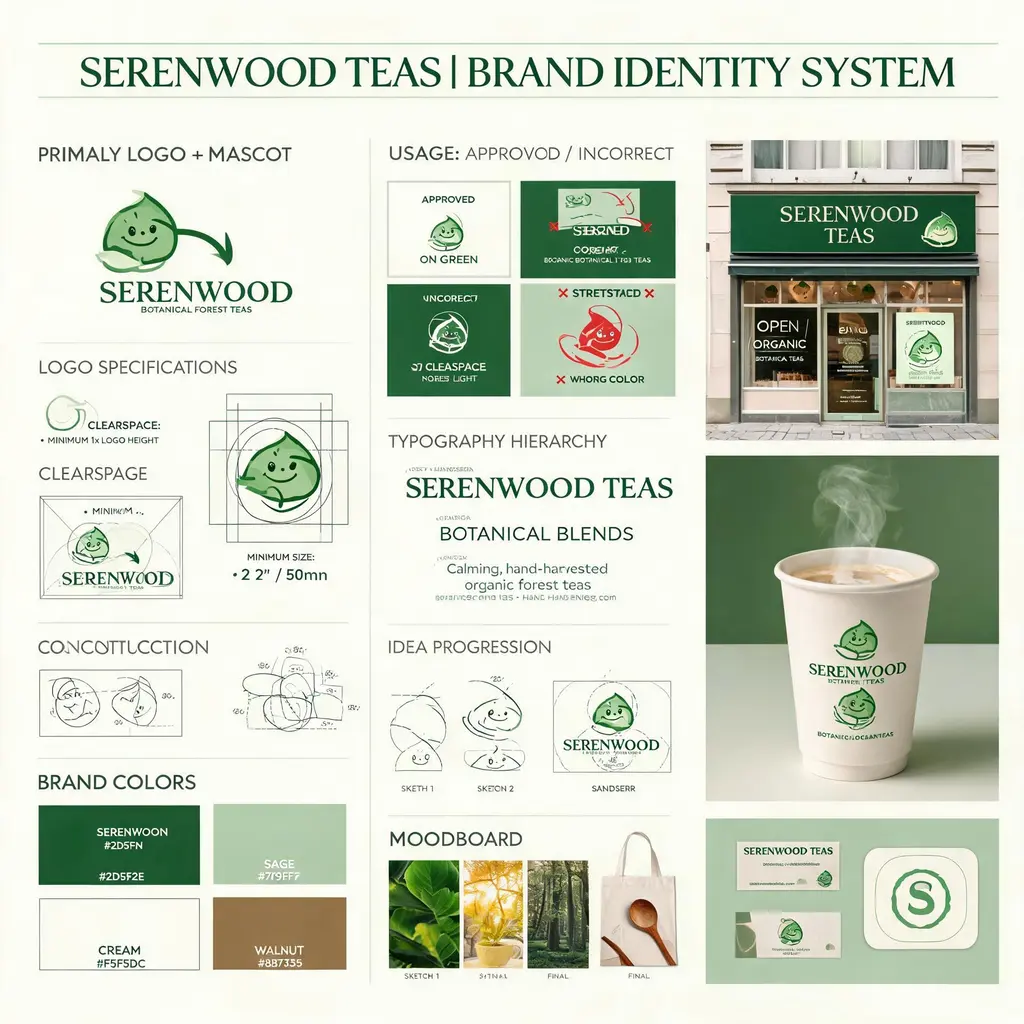
電商版面
品牌識別提案板
把虛構的品牌需求做成代理商風格的識別板,含標誌製圖、色彩、字體、使用規範、概念草圖和精緻的實境模擬圖
完整提示詞
電商版面
角色周邊型錄
把原創角色做成官方周邊型錄傳單:主視覺標頭下,是編號排列的壓克力立牌、徽章、T 恤和鑰匙圈
完整提示詞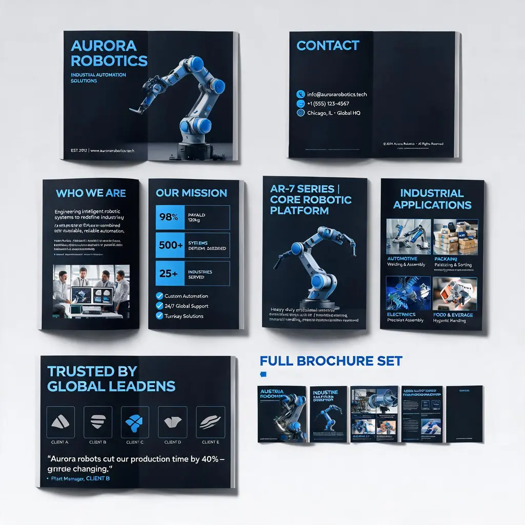
電商版面
企業型錄整套設計
把公司或產品描述做成質感的多頁型錄:封面、簡介、產品、應用情境和案例頁在同一套品牌風格下,最後附整套預覽
完整提示詞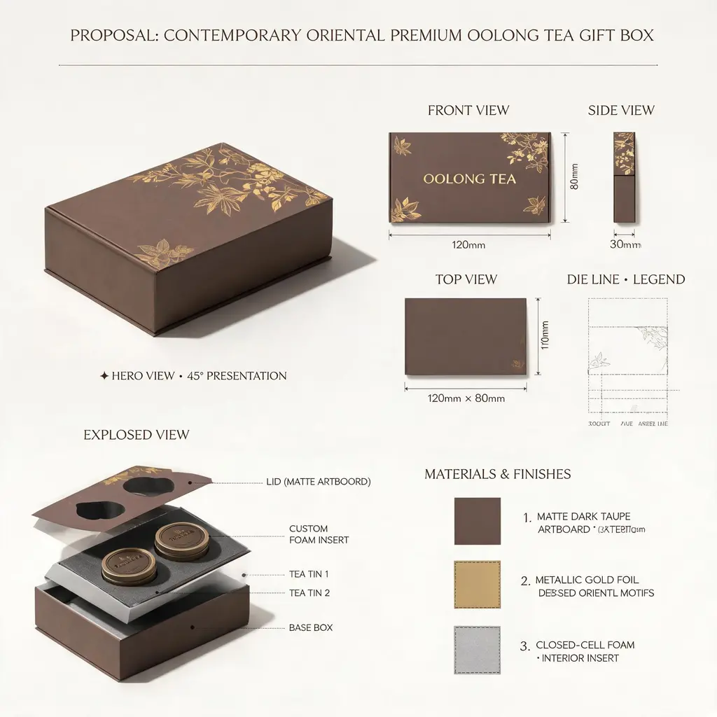
電商版面
設計提案看板
把產品或包裝構想做成頂尖工作室的提案圖:主視覺立體圖、三視圖、刀模線、爆炸內構、材質色票和標註尺寸全在一張板上
完整提示詞