前后对比图
把一次转变拆成两块匹配的面板,用干净的分隔线和一致的取景,并原样呈现你写的标注和数据。
更新日期:
完整提示词
英文提示词包含建议的示例需求。生成前请修改主体和细节。原始示例输入和生成参数尚未完全核实。
推荐模型: GPT Image 2
Design a clean before-and-after comparison image built as two clearly divided panels of equal size, split by an elegant vertical center divider. Place the before state in the left panel and the after state in the right panel, keeping the subject, framing, scale, angle, and camera distance identical between the two sides so the only visible difference is the transformation itself, with the left showing the starting condition and the right showing the improved result. Label each side with a small, clear caption, and if the user provides metrics or result data, present them in a tidy row or small grid beneath or between the panels with clean type. Render any text the user supplies, including the before and after captions, percentages, or data points, exactly as written, correctly spelled; never invent statistics, claims, or filler wording, and leave data areas clean if no numbers are given rather than adding placeholder text. Keep lighting consistent and honest across both panels so the comparison reads as credible rather than exaggerated, and add a small product thumbnail if it belongs. Use a clean, professional layout with aligned margins and balanced negative space. Do not add watermarks or clutter. The result should look like a trustworthy campaign comparison. Use the details below for the subject and the exact before and after states.
官方示例
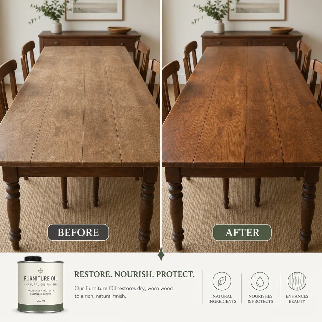
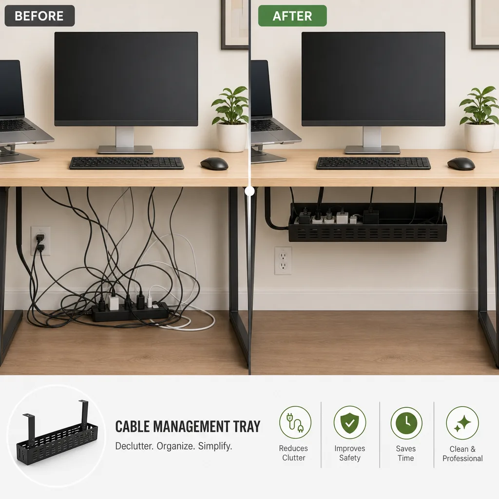
提示词技巧
- 清晰描述前后两种状态,让两块面板只在结果上有差别
- 把标注和百分比放进引号,标签才会精确呈现且更可信
- 两种状态保持相同的主体和角度,对比才显得真实可信
相关提示词配方

电商版式
促销海报
排出精致的竖版促销海报,含清晰的标题区、主角产品和行动号召,并把你提供的任何文案原样呈现。
完整提示词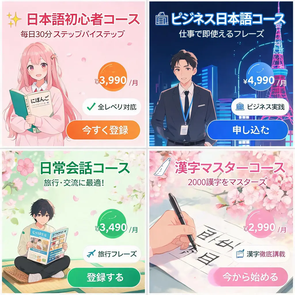
电商版式
日式广告横幅套装
把一份活动简报变成协调统一的日式网页广告横幅套装,包含醒目文案、价格徽章、卖点印章、主视觉和清晰的行动按钮。
完整提示词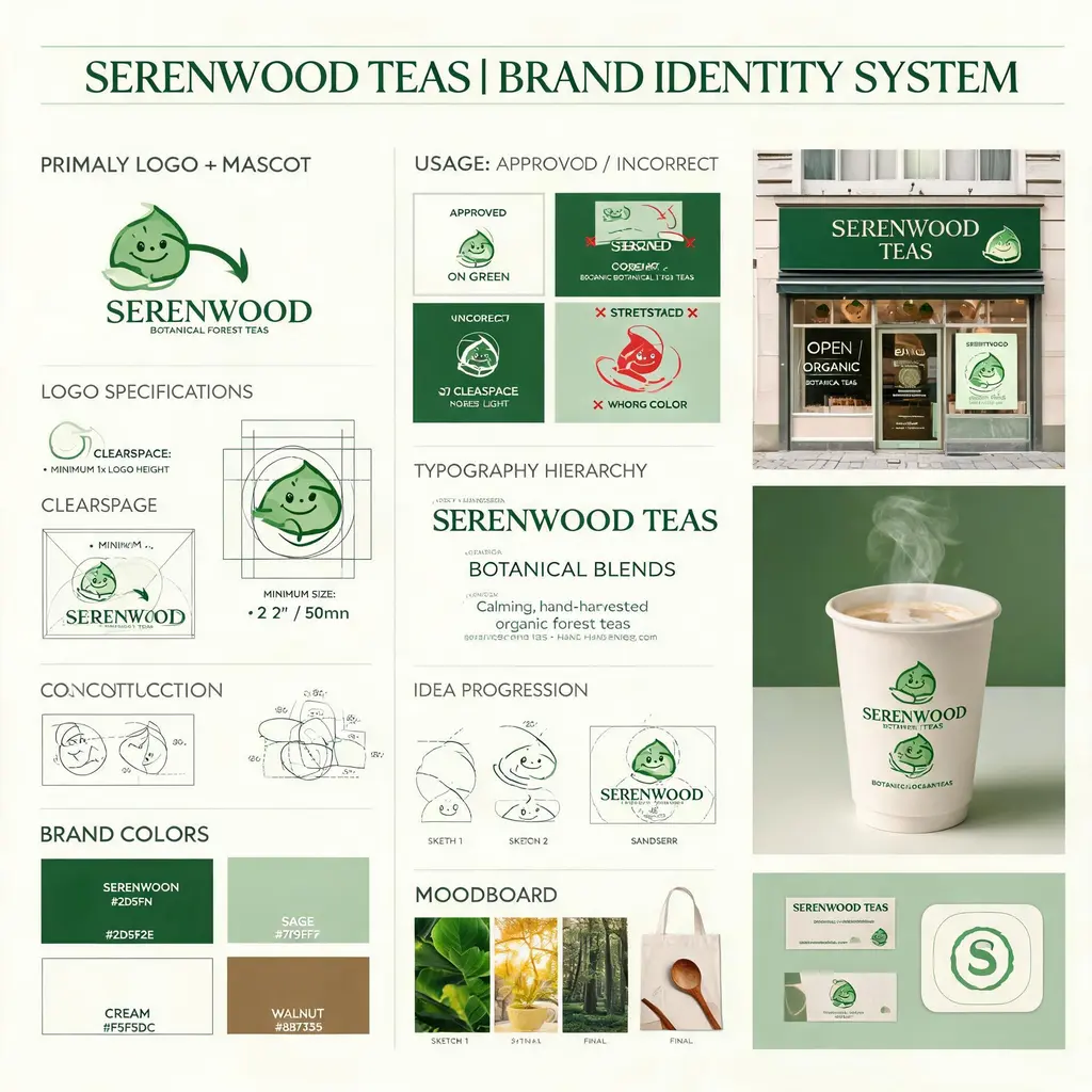
电商版式
品牌视觉识别板
把虚构品牌简报变成设计机构级的视觉识别板,完整呈现标志构造、色板、字体、使用规范、概念草图和精致的真实应用样机。
完整提示词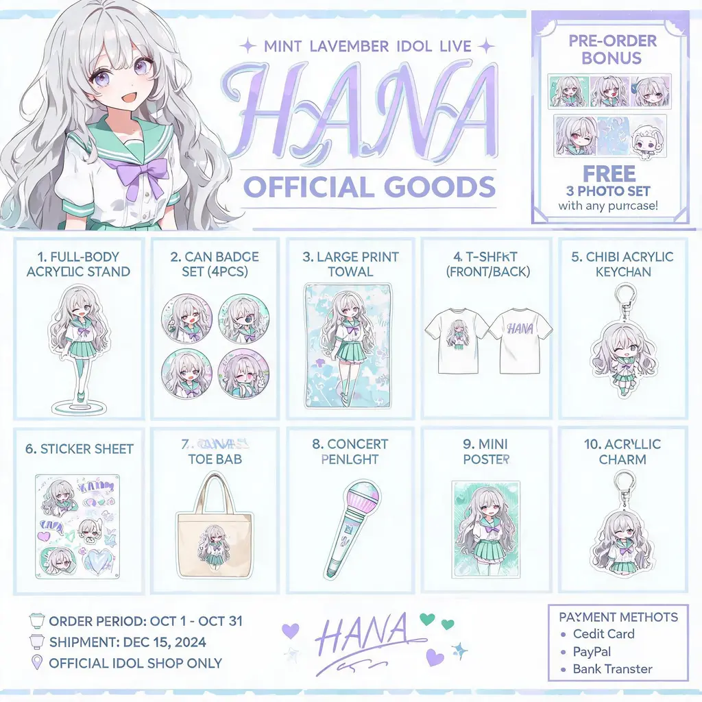
电商版式
角色周边图鉴
把你的原创角色变成官方周边图鉴海报:亚克力立牌、徽章、T恤、钥匙扣按编号排成商品网格,顶部配主视觉横幅,随时可以分享给粉丝。
完整提示词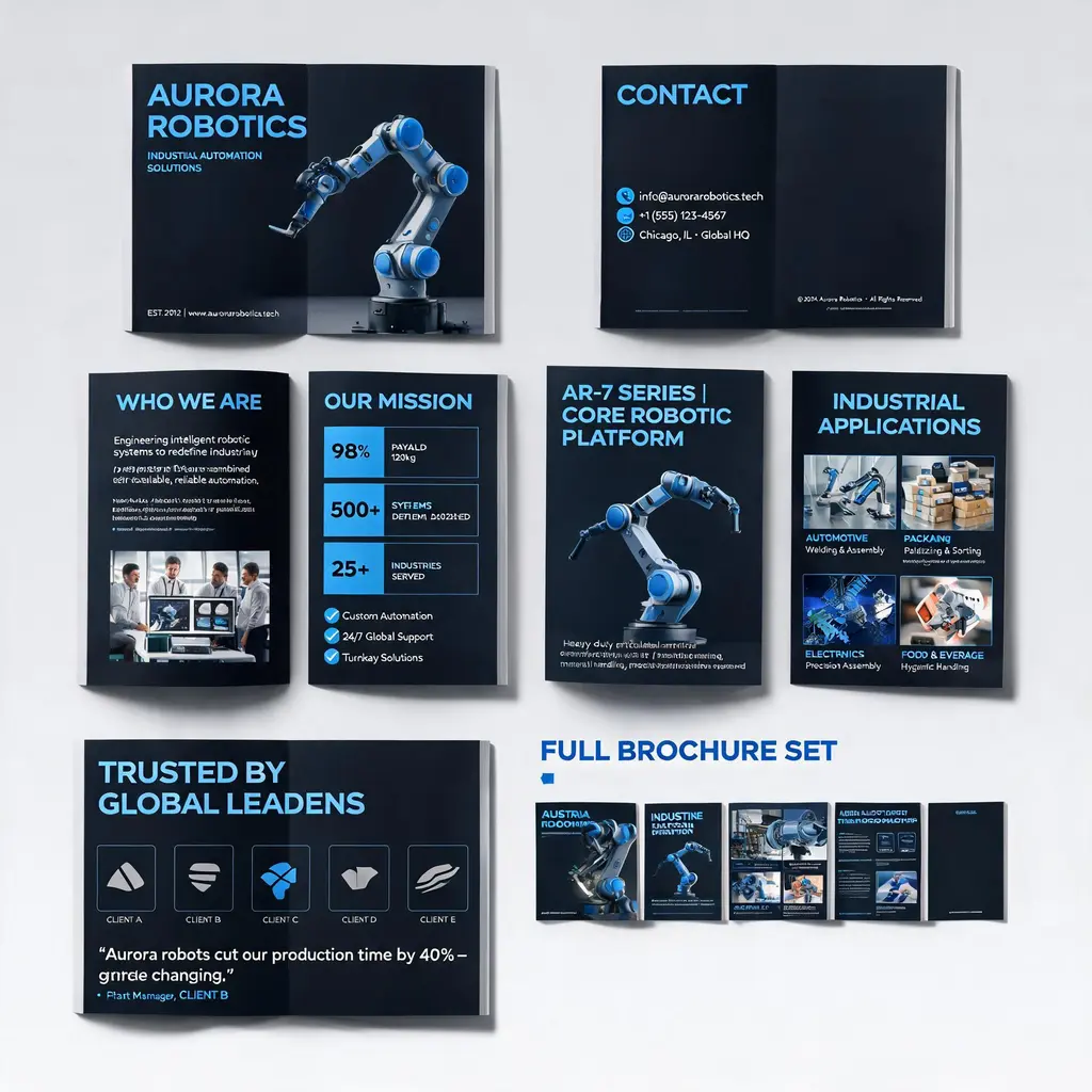
电商版式
企业画册系统
把公司或产品介绍变成高端的多页企业画册方案:封面、企业介绍、产品技术、应用场景与案例页统一在同一品牌视觉之下,并附整册系统预览。
完整提示词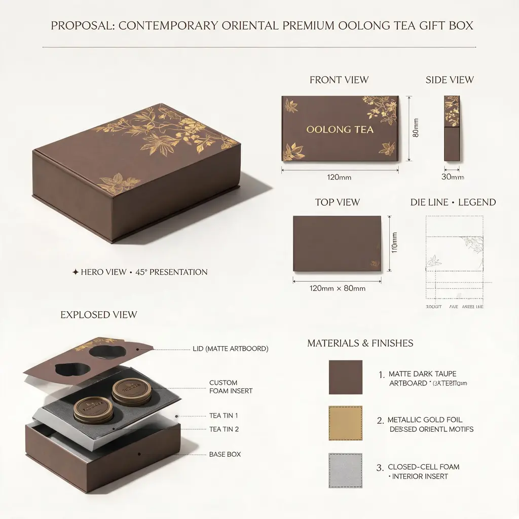
电商版式
设计提案展板
把任意产品或包装创意呈现为顶级工作室的提案版面:主渲染图、三视图、刀版结构、内部爆炸图、材质工艺色卡与标注尺寸汇于一张展板。
完整提示词