Voor-en-na-vergelijking
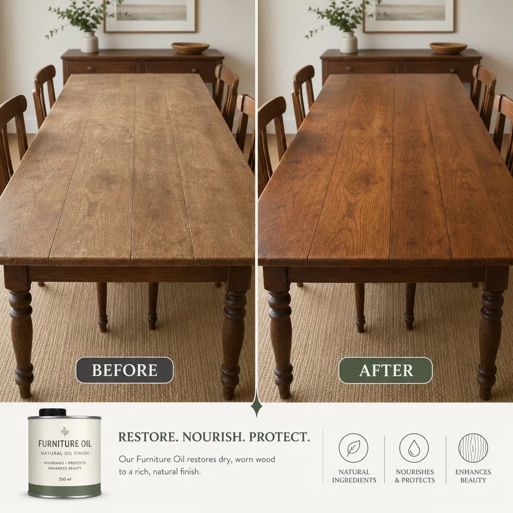
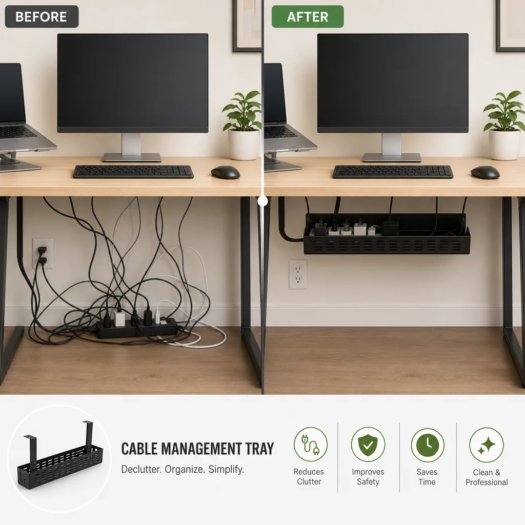
Splits een transformatie in twee gelijkvormige panelen met een strakke scheidingslijn en dezelfde kadrering, waarbij je bijschriften en cijfers exact worden overgenomen.
Bijgewerkt:
Volledige prompt
Engelstalige prompt met een voorbeeldverzoek. Pas het onderwerp en de details aan voordat je genereert. De oorspronkelijke invoer en instellingen van de voorbeelden zijn niet volledig bevestigd.
Aanbevolen model: GPT Image 2
Voorbeelden van OmniArt zelf
Verwante promptrecepten

Promotieposter
Bouw een verzorgde verticale promotieposter met een duidelijke kopzone, het product als blikvanger en een oproep tot actie, waarbij alle tekst die je opgeeft exact wordt overgenomen.
Volledige prompt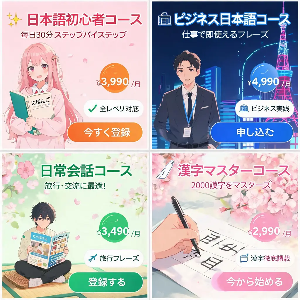
Japanse advertentiebannerset
Zet één campagnebriefing om in een samenhangend vel Japanse webbanners met pakkende teksten, prijsbadges, voordeelzegels, beeldmateriaal en duidelijke CTA-knoppen.
Volledige prompt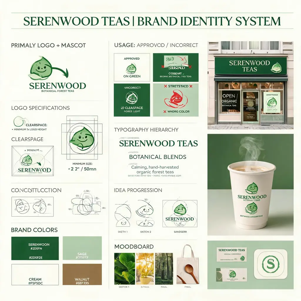
Merkidentiteitsbord
Zet een fictieve merkbriefing om in een identiteitsbord in bureaustijl, met logo-opbouw, palet, typografie, gebruiksregels, conceptschetsen en verzorgde mockups in de praktijk.
Volledige prompt
Merchandisecatalogus van een personage
Zet je eigen personage om in een catalogusflyer met officiële artikelen — een genummerd raster met acrylstandaards, buttons, T-shirts en sleutelhangers onder een keyvisual-kop, klaar om met fans te delen.
Volledige prompt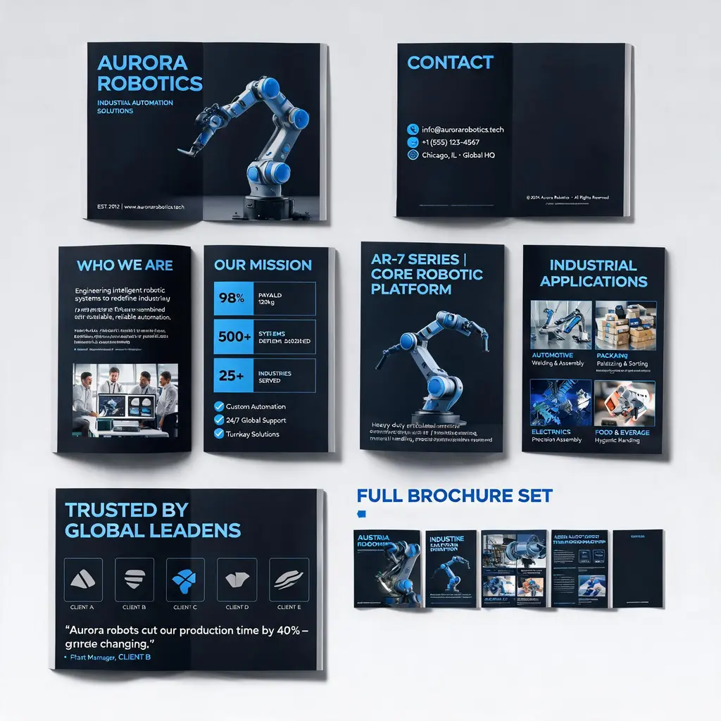
Bedrijfsbrochurereeks
Zet een bedrijfs- of productbeschrijving om in een hoogwaardige brochure van meerdere pagina’s — omslag, introductie, product, toepassingen en cases onder één merklook, met een overzicht van de hele set.
Volledige prompt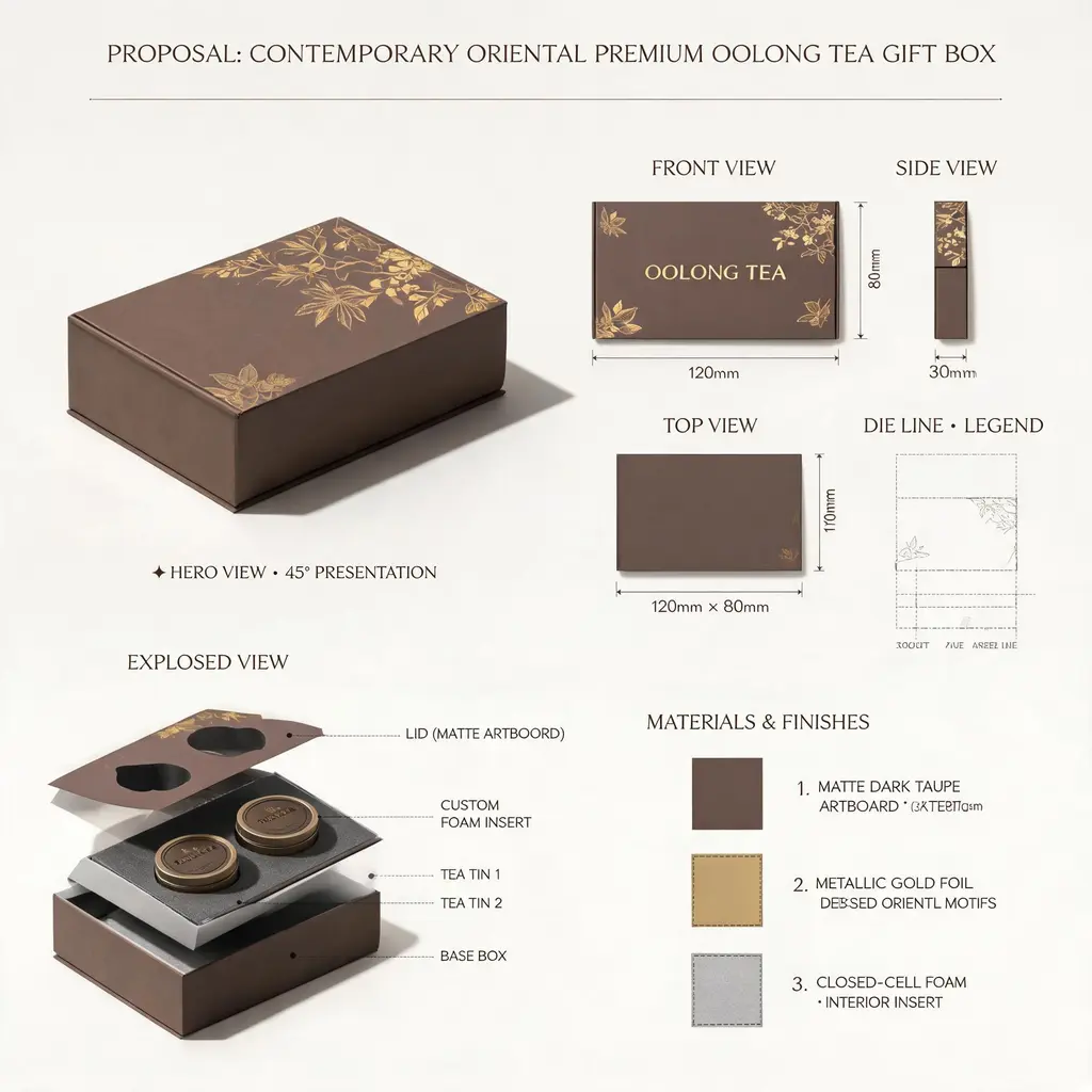
Ontwerpvoorstelbord
Presenteer elk product- of verpakkingsidee als het voorstelblad van een topstudio — hoofdrender, orthografische aanzichten, stanslijnen, opengewerkte binnenkant, materiaalstalen en maatvoering op één bord.
Volledige prompt